Automatically add a banner from the context
In the case of a banner that is automatically built from the context, Profit determines the items based on the crumb trail. First the references of the current level are included, then those of the parent level. This is repeated until the maximum number of set references has been collected.
To automatically add a banner from the context:
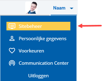
 Log on and start Site management.
- Open the page to which you want to add a banner.
- Click on: Edit (in the Page frame).
- Click on: Layout.
- Click on: New in Page parts.
- Click on: Banner.
- If required, enter a Title for the banner.
- Select the Show component frame and title check box if you want to display a line around the banner with the title you entered.
- Select the source Automatically from context (breadcrumb trail) or Automatically from context (page).
- Select a value for Presentation style.
More information:
Presentation style - Select a value for Maximum number of references.
- Select a value for Banner image format.
This field is only available if you have selected the presentation style Image. You can now also specify that you want to display text for the images. The description of the image will then appear under the image.
- Select a value for Navigation style.
This field is only available if you have selected the presentation style Carousel. You can use the navigation style to display buttons next to the banner which the visitor him/herself can then use to open the next or previous image.
- Select a value for Animation style.
For example, you can allow the images to Float within if a visitor opens the page. The default setting for the animation style is Zoom out.
More information:
Animation style - Select the Shortcuts check box if you want to give visitors to your site the option to start the part using a hotkey.
This is useful, for example, if you have a banner with images. You can then start all images with their own hotkey.
- Wrap text: if the text of the banner is too wide then, if you use this option, the text continues on the next line. You can only select this option for the presentation style 'List (below each other)'. With any of the other options, if a text does not fit it is simply truncated.
- Click on: Create.
- Click on: the part of the banner.
- Click on: Properties.
- If required, select the Group in which you want to display the banner. You can choose from:
- Banner menu level 2
The linked image appears in the left column of the page.
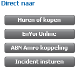
- Directly to
The text of the reference appears as a link in the right column of the page.
- Related site
You use a related site, for example, if you have a website in a number of languages. The link is then displayed at the top right of the page.
- Main banner
The image is displayed in the banner at the top of the page. For both Banner menu level 2 and Main banner, you are obliged to link an image; otherwise, nothing is displayed. If you have entered a 'Text banner' in the properties of the page then it is displayed with the original text. The same applies for the original image.
- Banner menu level 2
- Specify the height of the banner.
You can choose from:
- Fixed height: you enter the height of the banner yourself in pixels. If an item does not fit in this fixed height, it is not displayed. If nothing is displayed, then change the fixed height. If you use less space than the specified height, the remaining space is filled with white space. This allows you to display multiple items next to each other which are not of the same height.
- Full content: here you specify that you want to display all the items that are available from the source. The height is determined on the basis of the items so that all items will fit.
- Justify: the height is determined by the available space in the column. You can only choose this for banners you include independently in a page. For banners in a custom layout, you cannot choose this option because it is not possible to determine the available space. A banner that has been set to Justify, uses all the available space in the column. The height of the column is determined by other parts that appear in the same line. This is useful, for example if the banner is placed on a line with other columns that have parts with a variable height. The height of the banner is then determined by the other part.
- Enter any margins.
- Select the Language restriction check box if you only want the banner to be displayed on a site in a particular language.
- Click on: Modify.
- Click on: Publish.
- Click on Yes in the message.


|
Directly to |